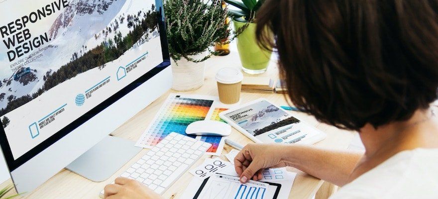


Responsive Layout
Your site will look great on multiple screen sizes with responsive layout for desktop/tablet.
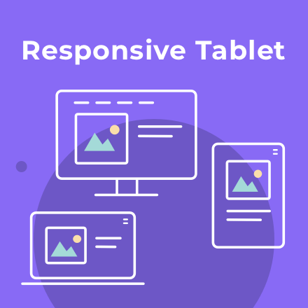
Your site will look great on multiple screen sizes, including iPad, with responsive layout for desktop/tablet, which enables you to control site layout according to breakpoint (1024 px) rather than device.
Easy control over your site layout
Responsive layout means your site looks better on multiple screen sizes, for a better experience for site visitors. This means, for example, that a top navigation header on larger desktops automatically switches to a hamburger menu when the screen size is below 1024px.
GET THESE AWESOME FEATURES & MORE!
Click below to get our free updates by email, or if you're not already a client, click to schedule a free demo so we can help your business connect & grow!
Featured Article:

Other Recent Articles From Web Wisconsin: